Saturday, April 28, 2012

Week 8 - Project Development

The design I've been working on aims to draw attention to the cliff at the wharves and to bring people into the building through integrating its form with the pathways.
These are a few of the rough development sketches, I've kept the root system idea as a way to create an interesting building envelope and as for the interior of the building, I'm thinking of using stone/natural materials - also still going with the idea of a study space/small library open to the public and the option of having a general function room and/or display space. I think it'd also be good to offer some studio-style classes (maybe art classes, seeing as this will be designed to be an inspiring space?)

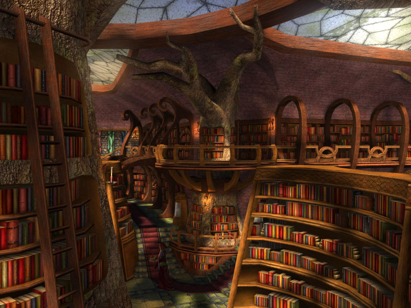
Here's a more developed concept drawing of the building on site (which has become parklands as specified in brief - forgot to put the new ferry terminal in this drawing, but it is assumed that it will be along the open stretch of river bank seen in this pic. I'm thinking of pushing the building back into the cliff a little more, its a bit hard to see here, but it currently sits flush with the cliff face - I'll be putting some sections up soon to better show the details. Anyways, its a multi-level design, first level being main entry up steps into a general sitting/stop over area and access to a coffee/news kiosk thing (still deciding) and bathrooms. Second level has an open balcony in the middle which is backed by the natural finish of the cliff and looks through the root canopy running down the side of the building over the river, it also has a small library room with a selection of books/magazines  (I may make this a digital library - just offering access to computers as this would probably be a more popular solution), and a few private study areas. The third level has a curved clear ceiling/facade wall which creates interesting patterns through the canopy, the interior space will have flexible furniture/room arrangements to allow people to create group study areas if necessary and have individual spots (also with power points for laptop charging), this is also where the (art?) classes will be held (again with flexible room spaces, maybe walls which can move between permanent pillars in the room?), it is assumed that this will be the most popular level.

I'm considering if it might be a better idea to change it to two levels instead of three, but have them spread out a bit more because some people might not see it as worth their time to go up three levels for a study space? I might just be over thinking it, I'll see how the floor plan for three levels turns out and if I'm not happy with it I'll play around with the two level thing.

Also, I still want to keep the interactive sound pillars from the folie design (thus keeping our manipulated sound/sound reflection theme going) I think it would be interesting to have in the building, just for people to interact with - I'm thinking of possibly using the balcony space on level two or putting them somewhere at ground level as these would be most accessible, also having them exposed to natural airflow/in an outdoors environment was important to our initial design.

As for the medieval style theme I was considering last week, I would still like to maintain part of that idea by using those kinds of simple/rustic materials inside the building, but also using some of the shapes from that style of building such as the buttress arches/pillars. I think these would match really well with the root canopy  since it could work to appear as the two features support each other and the floors of the building are suspended mid-animation, held up by the two forces.

Ok, so I've still got all these thoughts going through my head but I've probably done enough typing out for the time being. I'll be doing up some more perspective sketches (hopefully some interior ones too), sections and floor plans to upload soon and then it'll be time to put the presentation together.

Wednesday, April 25, 2012

Week 7 - Project Development


This week I have managed to clarify how I want to approach this project. It was a bit unclear exactly what I was trying to design previously, but after discussing it with my tutor I've got the brief a bit more under control. In terms of building function, I aim to design  a flexible space for people to come and study and/or learn a bit about the city. This will be mainly aimed at students and tourists. It will have a direct link from a new ferry terminal which will be placed at the site. The initial idea of sound reflection (from our folie design) seemed a bit of a weak concept to base this building off so, after much discussion with my tutor, I've decided how I want to design my building:
  • Draw attention to the cliff face (one of the features I liked most about the site)
  • A mostly elevated building (to bring attention to the cliff face and to decrease the risk of the building flooding considering its location)
  • Use the reflection concept (from sound reflection of the folie) to emphasize the cliff face, also still liked the sound pillars from the folie design, maybe keeping/modifying these for the new design
  • Draw attention to materials on the site and incorporate this into the design (mainly like the rock textures)
  • Maybe a medieval style buildings (most of the buildings going up around the city are a modern design and just kinda the same, I would love to give a building which just feels different and inviting - that and I really like the style and materials used in these types of buildings - particularly the buttress ceilings/pillars and the stone construction. Also, Brisbane doesn't really have many buildings of this style, mainly because its a fairly new city compared to most European settlements where this building style can be seen a lot more, so I think this could contribute well to the cultural aspect of the city).
  • It will be a mostly open library space, with flexibility to offer function space and an information display space. Thinking of doing something with the space below the building as well, maybe something along the lines of news/cafe/dining type stuff without being to intrusive to the area (good for taking a break from studying or as a stop-over point for people getting off the ferry or passing through on the bike/pathway)
I'll be uploading some concept sketches soon after I've played around with these ideas a bit more, but I'd also like to add a couple of pictures that I thought might help a bit with my design process (just a few examples):

Rockwall Bar & Grill Designed By Dock4 Architecture
Obviously not medieval style, but I like the rock wall at the back and then looking through the glass facade

Even though this just looks like a render and I find the book cases to be a bit busy, I like the multi-levels and the open ceiling. Also, the tree in the middle of the picture reminds me of the mangrove concept I was considering last week.

The Troll Wall Restaurant by Reiulf Ramstad Architects
I liked this one because of how it manages to integrate with the surrounding environment, but by using glass, the structure isn't to invasive.

Friday, April 20, 2012

Week 6 - Idea Development

So considering the research into the site done last week, I think it would be beneficial to look at the design in terms of access points and looking into flood resistance. Also, bringing in the main idea behind the initial folie design of experimenting with the senses (in our case, focusing on sound) and keeping it as a structure which can be used as a "through way" as well as a building for people to stop and have a break in. On a personal-preferences level, I'd really like to look at the materials on site (the old materials from the air bunkers and the stone face of the cliff).

A thought considering the last design compared to what this will turn into, was the original folie focused on emphasizing noise, but perhaps creating a soundproof area (internal) and a kind of sound passage way (external) would be more effective? I guess it would a way to contrast the intensity of the senses though the structure by providing different effects in different spaces, although I'm not really sure if it would be the best idea to implement this in a building which is being designed to aid learning.


From the research done it is clear that the main issues with the site are:

  • flood inundation
  • maintaining historic buildings
  • concern over impact on view (particularly from New Farm)

As much as I tried to veer away from focusing on how the river could impact the site through flooding, it seemed that would be a point I'd always end up coming back to. With this in mind, I thought it might be a good idea to look to aquatic/semi-aquatic life (since this is the nature studio) for inspiration.
A good point made in the lecture about "Working without computers" was the analogy used to explain a design which could build itself. Coral builds itself in particular formations just by its own knowledge, would it be possible for a building to do this? Also, some attract prey by looking like a food source/safe place - one particular coral that did this was the sea anemone (above image). Could this be related to buildings (obviously without the prey part of it) by bringing people to a building disguised as something else?


This brought me back to looking at sound (from our first folie) and how nature can achieve sound through a structure. The sketches above are of some plants which (through purpose or coincidence) create sound - with the exception of number 4, the mangroves.
  1. Yellow rattle plant: semi-parasitic, steals some nutrients from neighboring roots, fruit/flowers are dry capsules containing loose seeds which make rattling sounds when the plant moves in the wind.
  2. Marcgravia evenia: a plant I thought was interesting because it is designed so that it emits more prominent sound waves back to bats instead of focusing on a more striking appearance to attract birds (this is because it relies on bats for the process of pollination). The sketch above shows the special shape above the flower and how it reflects sound.
  3. Phyllostachys/Bamboo: bamboo makes a distinctive, hollow noise when the tubes of the plant hit together. The hollow chambers of the plant stem have also been used to make different types of instruments.
  4. Mangroves: I looked into this more because of its semi-aquatic survival mechanism rather than sound making ability. The root structure is really unique and quite a beautiful form - not to mention how much it can vary between different plants of this species. Also worth noting is the pneumatophores of the plant (the individual spikes which stick out above ground) function as kinds of snorkels when the roots of the plant are under water. These reminded me of the sound tubes in our original folie (although these are far to soft/not the right material to create any sound effect) and the root system as a whole just draws interest to itself, this could potentially be used in the design some how.


This diagram is a cross-section of the site showing how the structure of the mangrove roots could be used to create a form which becomes part of the landscape and uses this unique system (possibly by extruding the section or by creating an entanglement of root/beams and putting webbing between them).

Here is a possible view of what the structure above could look like if using the second method mentioned above. The top part of the structure (where the flood reached/where it is least likely to be water damaged by the river) has an enclosed internal space with solid or transparent webbing between the structural members, it is also denser around the top of the structure to aid with shading from strong sunlight. The bottom half of the structure is a through-way for people to travel under the building, but creates a unique experience by walking through the entanglement of structures. This arrangement could also be used to create some stop-over spaces in the shade below the main buildings for passers-by.

This is another section showing the advancement of this particular idea, the open space is above, less crowded by "roots" through the space, but could still maintain the appearance of the webbing effect in the previous discussion. The pillars below the building (kind of like the pneumatophores of the mangrove) act as sound reflectors, maintaining the idea of sound reflection from the folie.

I wasn't to sure about having the out-looking face of the building being completely curved or filled over, so this sketch explores how the structure could be brought back a bit into the cliff face to better use the facade space to create a better user experience. Of course it could still maintain some attributes from some of the previous sketches, this is mainly just for exploring different approaches to the design.

Monday, April 16, 2012

Week 5 - Site analysis


The image above shows the location of the site in relation to surrounding suburbs. As you can see, it's pretty much the center point between the surrounding areas. This would mean that it is an excellent through-point for people in the city, which could be used to the advantage of the folie design.
Also note that that the different suburbs have different "functions":
  • CBD: businesses/high-rises, shops, some apartment living (mainly closer to the rivers edge)
  • Kangaroo point: residential/apartments, some parkland, some cafes/dining
  • New Farm: residential/housing, cafes/dining and boutiques, primary school, some parkland
  • Fortitude Valley: businesses, shops, dining, clubs, some apartment living
  • Spring Hill (not really as close to the site, but still relevant): residential, businesses, schools, cafes

This image shows the main roads in the suburbs surrounding the site.

This image shows the levels of traffic congestion (cars and buses) on the main roads surrounding the site on a normal day. The green roads show normal flow of traffic, yellow shows medium congestion and red shows a high amount of congestion. Note the most congested roads are within the CBD itself and lead into The Valley.

This image (from the Australian Government website) shows the estimated water levels from the December 2010/January 2011 floods. The orange lines show suburbs dividers, while the blue patches represent areas which were inundated with flood water. Its visible that the whole of the Howard Smith Wharves was under water (the extent of which can be seen in the image below).


Through research into the site, it was found that there was initially a proposal to turn it into a commercial district (hotel, sports and entertainment facilities), but was rejected by the local community. It was then proposed to be turned into greater public/green space, but was denied by council on concerns of flooding. In my research, I found there to be 3 major problems with this site:
  1. Physical: the site has a high likelihood of flooding with heavy rainfall, as it is on the edge of the river
  2. Historic: there are 5 existing air-raid shelters on the site which are heritage listed, locals have also expressed concern of commercialization ruining the historic sense of the site
  3. Cultural: as this is close to residential suburbs, the community has expressed concerns about what impacts a new development will have on the area and also about new buildings affecting the view from their suburbs (the project brief states that the new structure/s be no higher than the cliff, this should reduce the problem of view obstruction).
It is assumed (for the purpose of this project) that the site will be a parkland area, that there will be a functioning ferry terminal somewhere within/near to the site and that the walkway connecting New Farm to the CBD is fully functional. With this in mind, some concerns from the public (before the floods) were that the walkway was a bit daunting at night through the stretch of Howard Smith Wharves and that having some kind of development there would be beneficial to public safety.


Sunday, April 15, 2012

Project 1 Posters


"The invisible energy sweeps around the sleeping object, nudging and provoking it to stir. It speaks of hidden motives to commence. The energy embraces the object as it gathers enthusiasm and they swing intertwined. Curving together to and fro in a lulling, serene sense of motion. Nothing could rob the duo of such peace.... But for the shattering disturbance that lies ahead."

The folie that can be found at Howard Smith Wharves, is based on a sensory experience that relies on the invisible forces of the wind and sound. It is designed to imitate the sensory aspects of a war bunker which brings to light the heritage of the site. Thus the folie teaches the users to heighten and better utilize the senses. While the folie is a metaphor of a war bunker, the sensory aspects one can learn from it, are entirely abstract. One of the most important features of the folie is the pendulum, which hangs is the middle amongst an array of steel columns. As the narrative suggests, the pendulum brings to life the invisible forces of the site such as wind and sound. As it is carried by the wind it collides with the columns creating sound that is bounced strategically back and forth throughout the folie. The emphasis placed on sound and the way sound is carried, relates directly back to the sporadic and heightened emotions brought about by the times of war originally experienced at the site.

Monday, April 2, 2012

Design Progression

After reviewing our research and ideas, we decided that we would try to bring our the "sensory history" of the site, both as a way to educate and a way to design the for of our folie. We wanted to create a connection with the bunkers at the site and let people learn through observation of the surrounding space and by experiencing the sounds of the site through the folie. We wanted our folie to be an alternate section of the path along the wharves to allow people to pass through on their own accord.

Above are some rough sketches of the initial concept showing how we wanted to bring sound into the structure. Having a polished concrete wall on one side and steel (or some other metal) cones on the other side to direct sound into the structure. These would be of varying sizes, similar to one of the example structures looked at in the previous post.


And these sketches show some of the layouts we explored:
  • Straight concrete wall, curved cone wall, and hollow metal pipes/pillars scattered through the middles (these would be open top to create echoing when the wind blows over the tops of them, they would be different heights to produce different sounds).
  • Curved concrete wall, possibly with some form of seating in the curve with a slightly straighter cone wall. Steps would lead down into the folie to create the kind of "bunker" feel we were going for.
  • Another option was a semi-enclosed circular space, allowing some vision through the curved set of cones, with several angled beams above head to create changing shadow formations across the ground throughout the day. This idea wasn't that popular as we felt it didn't have the same potential for experience as the through-type structure the other layouts would provide.
Having the sound pillars seemed like a really good idea, and we soon started considering the different possibilities with them: different heights, lengths, widths, thicknesses of materials, having them on the ground or suspending them. We brought back the idea of having a pendulum which would swing with the wind channeled by the structure and strike the sound pillars, creating different effects. After much consideration, the cone wall idea was ditched as it became to impracticable to deal with and we felt that it wasn't really a strong feature of our concept in the first place, more of just an interesting idea to play with. So the cone wall became a solid metal wall (we were thinking wrought iron to relate back to the story bridge/history of the site or some kind of coppery or aged steel kind of look as we felt it matched the character of the surroundings).

Above are some images of our rough scale model (which we had been testing out a few of our ideas on) and a final concept sketch of how we wanted our folie to look. We would need to draw up some final diagrams/plans/sketches for our poster, but we were very happy with our design at this stage.

Design Ideas

After having looked at the designs for other folie-like structures and thinking a bit more about how we could better integrate senses into our design, we all came to the next meeting with a few ideas.

East Village Studio; New York City; jordan parnass digital architecture
Even though this image is of the interior of a house, it still embraces the idea of the small yet comfortable space. Keeping in mind that our folie need only be designed for two people, this felt like it could be a relevant image.

Shadow Pavilion; Ann Arbor, Michigan; PLY Architecture
This was undeniably an interesting design. The way the aluminium cones have been placed to create the shell of this structure is eye-catching and unique and would, undoubtedly, be quite interesting to view from the interior as well.

paris_install08
This bus shelter in Paris was not only an interesting design, but also incorporated technology with an LED touch screen for waiting passengers to use. This would relate to the learning experience we are to provide with our folie design. Even though this isn't exactly the most creative way to integrate learning technology into a structure, it still appears to be quite effective.

casar-de-caceres
This structure is interesting because it uses a material (concrete) in a way which we do not usually see it in (as a curved sheet/ribbon shape). While "warping" the conventional use of materials to create an interesting display would probably be technologically challenging, it can clearly result in an eye-catching structure.

XSFuture_pg080.jpg redtunnelxz
The way this structure engulfs the walkway and clashes with the surrounding landscape is oddly appealing. While its difficult to tell from the angle of the photograph if this is a structure you can climb through or if its just a sculpture, this structure still holds a lot of intrigue, almost calling those around it to discover its mysteries.

XSFuture_pg071.jpg roundroowooshomesx
This structure uses the bending of timber planks as a way to build a frame and an interesting piece of design work. The seemingly raw materials (though the timber would be finished) fit in quite well with the surroundings and, despite a fair amount of complexity for a small structure, gives off a peaceful feel about it.

Above are some quick sketches exploring potential ideas for a folie design (from left to right):
  1. A structure of twisted steel sheets, some faces polished, some faces matte. Aim of the structure is to warp the viewers perception by leading them through the different channels formed between sheets.
  2. A structure mainly made of timer, the walls and ceiling are continuous over the building, which would sit over the foot path, providing cover for pedestrians. A viewing box, perhaps with some educational material in it (?) is accessible via the stairs/seats on the side of the structure.
  3. A pod-based kind of structure with access via a central ladder, the pods could potentially have some kind of movement factor. This relates to one of the concepts discussed as a group of maybe one of the learning aspects be about space, the pods could be arranged like the solar system, with the interior of each designed to mimic the terrain/coloring of each of the planets. This is perhaps to literal of an interpretation of the learning concept, but it would be appealing to families with children as this could be a kind of fun way to learn.
References for images used above: